

In the first article of this series, we discussed the preparatory steps to steer your new corporate presentation on the right path. Here's a summary of the tips provided:
- What are the 1-3 takeaways that you want to get across?
- Know your audience, focus on their needs
- Concentrate on your core message
- Speeches are about stories
- Highlight & repeat what’s most important
- Start strong
- Call to action
Now is time to actually prepare something tangible... yes, I'm going to say it: create a Powerpoint! Badmouth Microsoft Powerpoint as much as you want. But if you work in a corporate environment you cannot avoid it. And if you ask me, I'm not sure you even should... but that's a topic for a different day. Now is time to create a Powerpoint document.
Tip8: Not a stand-alone document
Documenting means tweaking the content for asynchronous transfer of information i.e. reading. Presenting means tailoring the content for synchronous transfer i.e. listening/partaking. Those are two completely different contexts. Those need two different approaches and mediums. We often create presentations and intend to make them self-explanatory, use them as a documentation/reporting medium... and end up presenting them.

This is wrong. If I can read and understand your presentation on my own time, why should I give you X synchronous minutes of my life? Don't I have better things to do right now? And if I couldn't read and understand your documentation-style-presentation on my own time without your comments... then why did you bother creating it in the first place?
If you were to remember only one tip out of this list. It should be this: create your presentations for presenting, not for documenting. If you feel the need to document, add hidden documentation-slides. Present without them. Reveal the slides when you post the file for documentation purpose.
Tip9: 10/20/30 Rule: 10 Slides, 20 Minutes & 30 Font-Size
This rule overdoes it, but gives you a good idea of what we are aiming for:
- Few(er) slides (10 slides)
- A reasonable time spent on each slide (2 minutes)
- Less clutter on each slide (30-font)
Let's talk about the font-size 30 first. The text that is present on the slide should be the message that you want to communicate. Not more. Remove all the words that don't add something to the message. Remove that table full of numbers that nobody can read past row 2 anyway. You will end up with one sentence. And one sentence in 30-size font usually fits one line.
Now about the 20 minutes. 10-20 minutes is roughly the time we can spend in focus our full attention on something. Past that time, our attention drops. I could not find studies to back this up, but based on my empirical observations, I tend to agree with this rule. This varies with the type and style of the presentation itself. But use it as a ballpark value and keep your talks under 20 minutes if possible.
Last but not least: 10 slides. How long should you talk on each slide? Both extremes are bad, for different reasons:
- Speak only a few seconds on each slide, and your audience will become dizzy. Remember that if you know what is coming on the next slide, the audience has to adapt to it. When a new slide comes up, the audience needs a few seconds to parse and then make sense of it. If you end up changing slides every few seconds, you risk draining your audience's energy.
- Talk for a long time without support, and you are giving a speech. Think "father-of-the-bride-speech". This is not a problem in itself. But it is a completely different exercise. And few people are good at it. A good ballpark duration is 2 Minutes per slide. Which gives you the 10 slides rule. That said, I prefer to aim for 1 Minute, it suits my personal style better.
Tip10: 20-20 Rule (20 Slides, 20 Seconds)
hat said sometimes, your talk needs to be a bit more energetic. To keep people engaged and active use the following:
- Increase the number of slides
- Reduce the time spent on each slide
- Reduce the total time spent presenting
Use exactly 20 slides and make the transition of the slides automatic after 20 seconds, and you have the format called "Pecha Kuecha" ([petɕa kɯ̥tɕa]).
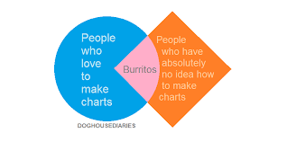
Tip11: Emphasize data with clean visuals
A picture is worth 1000 words is what they say. This is mostly true. A well chosen chart can relate a lot more than words ever could. It can show data in a structured way and its variations over time. It can put different values in relation with one another and in relation to common sense values (0°C, 0€, 100%).
When choosing a graph, think about what the message should be. In which way does the chosen representation helps communicate the message? Read this article to learn more about which representation to choose for which goal.
Be aware that it is very easy to mislead an audience with (un)wisely chosen chart representations. Head over to this webpage to discover more about this.
Visuals can also be pictures. A well chosen picture can be THE example that your audience needed to understand your point. Pictures can trigger emotional responses. This can be both good and bad. Beware!
Tip12: One thing at a time, one slide = one idea
This is the biggest mistake I see in corporate presentations.
When we create presentations with "documentation" in mind, we tend to structure the information and increase its concentration. We end up with wall of text or gigantic tables with 12 key learning each. To present, we need to bring the audience to focus their attention on one point only. We need one idea per slide. That means that if you show a complex table or a long list of bullet points on one slide, it can only be to:
- Show that it is complex
- Show the big picture of what we are going to look at in details right after
In no way should you go into details on that slide. And if you find it overkill to have only one idea per slide, use Tip 13 ; but sparingly.
Tip13: Animations
Imagine a big complex picture, which parts you reveal one after the other. You can keep such a complex slide, if you also manage the focus of the audience.
Whenever you show a new slide, the audience will first attempt to make sense of it. Only after that will they listen to you.
When you show a complex slide, the audience is first lost in their head before paying attention to what you are saying.
Best would be to not have such slides. But if you have to present the slide as is, animate the appearance of the points to focus the attention.
Tip14: Pay attention to the design
We already trimmed down the content of the presentation to its bare minimum. Now has come the time to make it present well. Here's your todo list:
- Limit yourself to 1 font, 2 colors in total (foreground/background) and 1 font size
- Do not use complex fonts, unless it serves your point
- Pay attention to the foreground and background colors and account for room conditions!
- Make sure all objects are aligned
- Prevent multiline sentences whenever possible
- Do not write full sentences unless it is a quote
- Limit punctuation to the bare minimum, you should not be making full sentences anyway
Tip15: Break the rules
Take all those rules with a pinch of salt and break them whenever you have the feeling you know what you are doing.
For example, try using 2 very different fonts, a colors palette (see Colorhunt for inspiration) and 2 font sizes.
That's it for this second part. In a third part we will have a look at the art of presenting.

